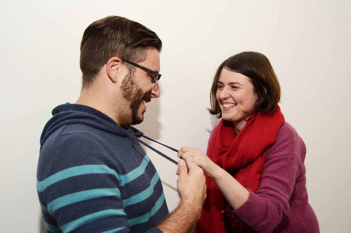
We’re reinvigorating the BFA Illustration blog for Fall 2018 with this post on 2014 BFA Illustration alumni Hannah Drossman who has recently been interviewed by AI-AP for Dart: Design Arts Daily. The interview delves into her personal practice and source of inspiration. To read the full interview, click here.
Category Archives: Alumni News
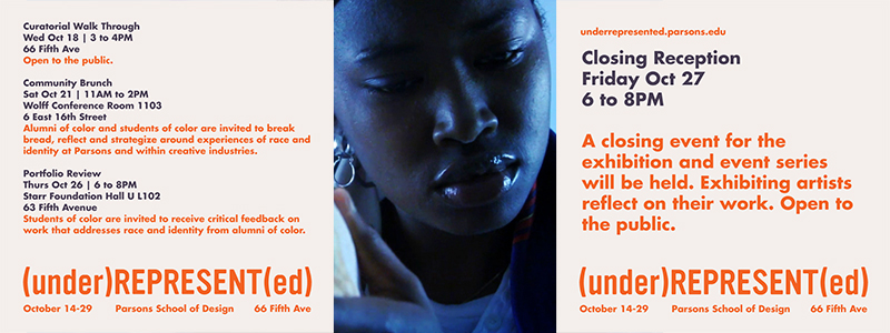
Special Events for Alumni/Students of Color: 10/21 Community Brunch, 10/26 Portfolio Review, 10/27 Exhibition Closing Reception
(under)REPRESENT(ed) Community BrunchSaturday, October 21 from 11am-2pm6 East 16th Street, Wolff Conference Room 1103Alumni of color and Students of color are invited to break bread, reflect and strategize around experiences of race and identity at Parsons and within creative industries.
Please RSVP: tinyurl.com/underrepresentedbrunch
Fb event:……………………………..(under)REPRESENT(ed) Portfolio ReviewsThursday, October 26 from 6-8pmStarr Foundation Hall- 63 Fifth Ave (UC), Lower levelStudents of color are invited to receive critical feedback on work that addresses race and identity from alumni of color.Please RSVP: tinyurl.com/underrepresentedreview
……………………………..(under)REPRESENT(ed) ClosingFriday, October 27 at 6 PM – 8 PM66 Fifth Avenue, Arnold and Sheila Aronson GalleriesExhibiting alumni reflect on their work. Open to the public.For more information, visit: underrepresented.parsons.edu or email us at underrepresented@newschool.edu.
(under)REPRESENT(ed) to Open at Sheila C. Design Center
October 17, 6-8 PM
Sheila C. Design Center, Arnold and Sheila Aronson Galleries
66 5th Ave, Ground Floor
New York, NY 10003
Closing reception with artist talk: October 27th, 6-8pm
(under)REPRESENT(ed) is an exhibition that features Parsons School of Design alumni of color whose creative practices explore the lived experience of race and aim to dismantle systems of racism. Initiated and organized by a collective of alumni of color, this exhibition features a range of disciplines which simultaneously address and resist the systemic exclusion that prevails in educational and professional institutions and practices.
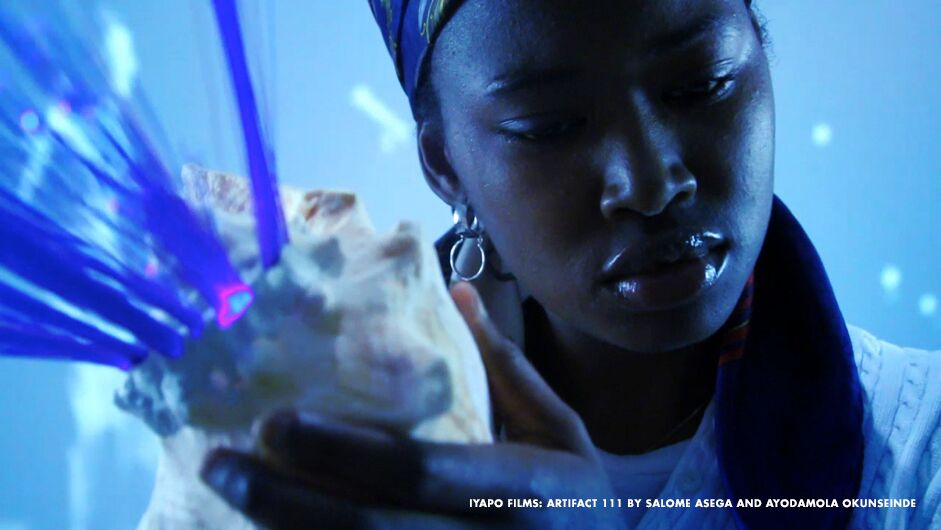
A video from a digital and physical archive that affirms the future of people of African descent; a design research project lessens the impact of hurricane season on one alum’s hometown in the Dominican Republic; a children’s book fable reveals an allegory of the dangerous journey migrants often face to enter the United States; an online syllabus resource explores the intersections of fashion and race; photographs reflect on the historic status symbol and power of hair in Korean culture, which resonates in communities across the globe; and a multimedia project promotes citizen journalism and challenges the normalization of police violence.
“We are moved by an urgency to foreground the power generated by creative practices,” said the curators of the exhibition. “Our own experience as students, practicing artists, designers, educators and cultural organizers tells us that this work isn’t always given its due criticism or celebration in the classroom and other institutional spaces.”
People of color have been pioneers in fields of art and design, although they continue to be significantly underrepresented in positions of power and compensation. Despite the rich foundational contributions by Black, Latinx, Asian, and Indigenous communities to these industries, they are often rendered invisible. The curators of this exhibition stake a claim for the centrality of those most deeply impacted by these oppressive frameworks in an era which challenges our existing tools of resistance.
The Parsons alumni featured in the exhibition are (AMT Alums in bold):
Salome Asega, MFA Design and Technology ’14
Rikki Byrd, MA Fashion Studies ’16
Raquel de Anda, MS Design and Urban Ecologies ’15
Nelson de Jesus Ubri, BFA Architectural Design ’15
Patricia Encarnación, BFA Communication Design ’14
Noelle Flores Théard, MFA Photography ’14
Scherezade Garcia, BFA Illustration ’90
Alston Green, CGRD Illustration ’72
Kim Jenkins, MA Fashion Studies ’13
Leslie Jimenez, BFA Fine Arts ’12
Sara Jimenez, MFA Fine Arts ’13
Yuni Kim Lang, BFA Communication Design ’09
Jeana Lindo, BFA Photography ’17
Joy McKinney, MFA Photography ’14
Joiri Minaya, BFA Fine Arts ’13
Ron Morrison, MS Design and Urban Ecologies ’15
Inyegumena Nosegbe, BFA Communication Design ’16
Ayodamola Okunseinde, MFA Design and Technology ’15
Isaac Paris, BFA Communication Design ’78
Kaitlynn Redell, MFA Fine Arts ’13
Jeff Staple, Illustration
Ken Tanabe, MFA Design and Technology ’04
James Terrell, MFA Painting ’02
Duncan Tonatiuh, BFA Integrated Design Curriculum ’08, BA Liberal Arts ’08
Robert Liu-Trujillo, BFA Illustration ’10
Christopher Udemezue, BFA Integrated Design Curriculum ’08
…
Organized by a collective of Parsons Alumni of Color
Havanna Fisher, BFA Fashion Design ’14, BA The Arts ’14
Scherezade García, BFA Illustration ’90
Joelle Riffle, BFA Communication Design ’13
Yelaine Rodríguez, BFA Fashion Design ’13
Sable Elyse Smith, MFA Design and Technology ’13
Nadia Williams, BFA Fashion Design ’01
(under)REPRESENT(ed) equity + social justice advisor: Gail Drakes
(under)REPRESENT(ed) research assistant: Claudine Brantley, BFA Candidate of Photography ’18
(under)REPRESENT(ed) research assistant: Barbara Byrd, BFA Fine Arts ’17
Contact us at underrepresented@newschool.edu
The exhibition will run from October 14, when an opening reception for Parsons alumni will be held, until October 29.
More info here.
Q&A with BFA Illustration Alumni Joe Hwang on AI-AP’s Design Arts Daily
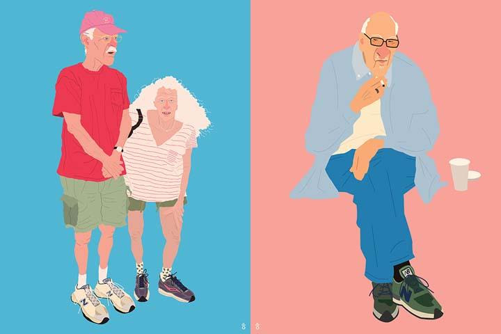
Joe Hwang is a recent graduate of Parsons BFA Illustration program. The work pictured here is from his thesis project.
The Q&A: Joe Hwang
By Peggy Roalf Monday, July 24, 2017
Q: Originally from South Korea what are some of your favorite things about living and working in the New York area?
A: I lived in Seoul, South Korea till 2010. In the summer of that year, I came to New York to study art. New York has much to see. I like wandering around the city, especially West Village and Upper East Side, watching people and the cityscape. I like those two neighborhoods because there are many elderlies, which is the main subject of my work. To me, elderlies in New York City are like beautiful historic buildings that have aged well. I also like that they have their own styles and live at their own pace, balancing out the overall pace of the city against the fast pace of younger generations.
Q: Do you keep a sketchbook? What is the balance between art you create on paper [or other analog medium] versus in the computer?
A: I use the back of used copy paper for sketches. Most of the times, I first sketch on paper, scan it to my computer, and work on it digitally in Adobe Illustrator. To me, both paper sketches and digital paintings are equally important. In the paper sketch process, I draw objects in detail, learning characteristics of them. In the digital process, I try to simplify the objects, leaving only the essence. I like digital painting because of the vividness in color and its cleanness. Meanwhile, I also make paintings based on my digital works because I also like working in the traditional way.
Q: What is the most important item in your studio?
A: My iPhone. I take lots of photos of people with it, which is the first stage of my work process.
Q: How do you know when the art is finished?
A: When I feel that the image I had in my head has been fully rendered.
Q: What was your favorite book as a child? What is the best book you’ve recently read?
A: The Insect World of J. Henri Fabre. He was a man of curiosity, wanting to know everything about insects. It was interesting that insects could be appealing to someone, instead of scary or gross. For a while, I wanted to be an entomologist. Recently, I mostly read the Bible.
Q: If you had to choose one medium to work in for an entire year, eliminating all others, what medium would you choose?
A: Acrylic paints. I like matte and fluid type acrylics because I like my paintings flat and bold.
Q: What elements of daily life exert the most influence on your work practice?
A: I try to go out every day. I like walking around the city, watching people and taking photos of elderlies I like. Elderlies with great style or interesting look are my inspiration for my work.
Q: What was the [Thunderbolt] painting or drawing or film or otherwise that most affected your approach to art?
A: I am very interested in fashion, so I get inspired by works in which fashion plays a big part. I especially like classic style and vivid colors in clothing such as the ’60s and ’70s styles and preppy style.
I like films from those years because I like what actors are wearing and the atmosphere in them. Breakfast at Tiffany’s is my favorite movie. In it, the styles of actors, scenes of New York City, and music by Henri Mancini make a perfect harmony. I also like Jean-Pierre Léaud’s style from the movie Stolen Kisses.
When I look at Alex Katz’s portraits, I get a similar impression. I like the combination of the classic style of models he portrays and the vivid and bold colors he uses. Even when I was in kindergarten, I think I was influenced by the style of Mr. Rogers’ style from his show Mr. Rogers’ Neighborhood. Especially, his closet filled with colorful cardigans was a big inspiration for me. I try to reflect those in my illustrations and paintings.
Q: Who was the [Thunderbolt] teacher or mentor or visiting artist who most influenced you early in your training or career?
A: When I was a kid, my mother and I would draw characters from commercial products and shows such as the man on the Pringles ads, Tony the Tiger on Frosted Flakes, and Chester on Cheetos. She is not an artist by profession, but she is fond of the arts. Also many relatives from my maternal family were artists: singer, fashion model, artist, etc. Watching their artistic activities laid a foundation of how to approach arts.
One day when I was a student at Parsons, I was struggling with a design for a postcard competition. My wife, who was my girlfriend at the time, saw me struggling and said, “Why don’t you use your sense of color and humor?” That was a lightening moment for me. I immediately came up with an idea for the design and finished it within a few hours. I even won the competition. The design was used for holiday cards by Aid for AIDS that year. From that moment on, that is my motto: to use my sense of color and humor.
Some of my teachers at Parsons were also good mentors, especially Noël Claro and Jordin Isip. They helped me broaden my perspective in illustration.
Q: What would be your last supper?
A: Anything with my wife.
Joe Whang is an artist and illustrator, born in Seoul, Korea and living in Jersey City, NJ. He graduated form Parsons School of Design with a BFA in Illustration. He is fond of vintage clothing and items. He likes to illustrate elderlies. His works have been recognized by Society of Illustrators, American Illustration, 3×3 Magazine, Applied Arts Magazine, and World Illustration Awards.
Website: http://www.joewhang.com/
Instagram:https://www.instagram.com/joestudy/
Upcoming Exhibitions
World Illustration Awards Exhibition at Somerset House, London. July 31 – August 28, 2017 Info
Group Exhibition Melted City 4 at RISD, July 22 – August 4, 2017 Info
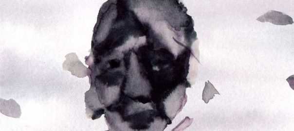
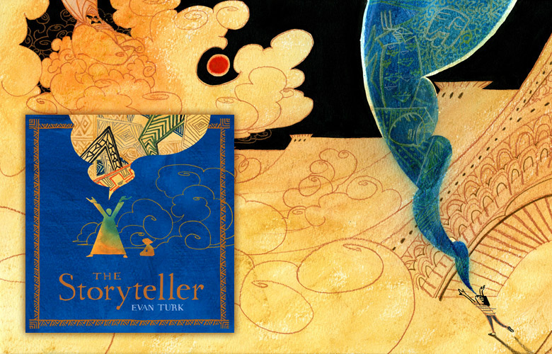
Launch party for The Storyteller by Evan Turk
Books of Wonder is delighted to host the launch party for EVAN TURK‘s debut work as BOTH author and illustrator. You and your young readers and listeners won’t want to miss The Storyteller, an original folktale that celebrates the power of stories and storytelling by this 2015 Ezra Jack Keats New Illustrator Honor recipient.
Long, long ago, like a pearl around a grain of sand, the Kingdom of Morocco formed at the edge of the great, dry Sahara. It had fountains of cool, refreshing water to quench the thirst of the desert, and storytellers to bring the people together.
But as the kingdom grew, the people forgot the dangers of the desert, and they forgot about the storytellers, too. All but one young boy, who came to the Great Square for a drink and found something that quenched his thirst even better: wonderful stories. As he listened to the last storyteller recount the Endless Drought, and the Glorious Blue Water Bird, he discovered the power of a tale well told.
Acclaimed illustrator EVAN TURK has created a stunning multidimensional story within a story that will captivate the imagination and inspire a new generation of young storytellers. So make sure you’re here on Thursday, June 30th when you can meet EVAN TURK and have him sign copies of all of his wonderful picture books! Ages 3-6. Thursday, June 30th, 6-8pm.
Illustration Alumni Feature: “Hyperakt” on Mashable
Read this great Mashable article on 2000/01 Parsons BFA illustration grads!
Peraza was an asylum seeker from Cuba, arriving in Miami as a child in 1984. Zeltser was a religious refugee from Ukraine who landed in New York as a teenager in 1993. The two met on the first day of classes at the New School’s Parsons School of Design in New York City in 1996.
“I was an annoying, arrogant loudmouth,” says Peraza, who has a healthy swath of hair on top of his otherwise closely shaved head. “Julia’s more studious, the good kid.”
While at Parsons, they discovered a healthy competitiveness and a shared drive to succeed, which they attribute to being immigrants.
“You just don’t take shit for granted,” Peraza says, noting the many “rich kids” who simply cruised by. “Every opportunity we got, we busted our butt to do it.”
Situated in Brooklyn’s Gowanus neighborhood, blocks away from a Whole Foods and the Morbid Anatomy Museum of death-obsessed hipsterdom, the cavernous storefront of social impact design studio Hyperakt stands out.
The open studio is quiet — the only sound comes from the humming tubular vents overhead and a handful of staff who confer in whispers. Most of the others focus quietly on their iMac screens.
Unlike stereotypically pristine, carefully curated design studios, Hyperakt’s space is a little more freewheeling. Utilitarian shelving units are haphazardly packed with supplies; dark, reclaimed wood desks with metal legs are pushed together to form long working spaces, flanked by contemporary office chairs on wheels.
Founded in 2001, Hyperakt’s 15-person team has focused on social impact design since 2009, when its cofounders, designers Deroy Peraza and Julia Zeltser, phased out the types of clients who needed things like dog leash branding or Camel cigarette ads in Spanish.
For the past seven years they have worked exclusively for NGOs, nonprofits and other social good organizations.
“It’s really satisfying to see memberships increase, donations increase and the caliber of volunteers rise,” Zeltser tells Mashable, decked out in a colorful woolly sweater and scarf of magentas and reds.
Hyperakt leapt into the social good sector full-force because it’s where the team created its best work.
Zeltser cites one client as a good example: educational nonprofit iMentor, which they’re currently helping to rebrand their mentorship program. Other clients include big names like the Ford Foundation, United Nations, NAACP, and Bill & Melinda Gates Foundation.
Sitting in Hyperakt’s conference room, moments after Zeltser shrieked with laughter when Peraza rustled up an old Camel ad they made, they reveal their two essential and successful marketing tools.
First is the active creation of community, both virtually and physically; for example, their once-a-month Lunch Talk series holds free and public forums among creative people, “designed to foster knowledge, sharing and casual conversation” over food and beer.
Second is spending time and resources on experimental, self-generated projects, which often go viral or land on design blogs and magazine pages. In 2008 they created posters in support of then-Senator Barack Obama that led to an exhibit at Flux Laboratory in Geneva, Switzerland. Hyperakt also took a challenge in 2013 to rebrand the teaching profession, an assignment from Kurt Anderson, the host of radio show Studio 360. And a noteworthy work in progress is On the Grid, a neighborhood guide for cities around the globe created in collaboration with local design studios.
Clearing her throat, Zeltser teases Peraza that she usually works on the jobs that bring in income, while he gets to experiment with viral hits like these.
“It’s the self-generated stuff that gets all the attention,” he counters, sounding slightly defensive.
The Refugee Project is one of these self-generated assignments. The team initially saw the U.N.’s refugee data in 2012, and while it was compelling, it was presented in such a dull manner that it might speak to academics but no one else.
So they collaborated with information designer and artist Ekene Ijeoma on The Refugee Project to allow users to easily see the exact number of refugees to and from countries by year. Ijeoma notes that in the past, photographs, rather than visualized data, have been used to communicate such social issues.
“But you can only see what’s in the frame,” he says. Data, he adds, provides a more expansive story.
The Refugee Project caught the eye of the Annenberg Space for Photography’s curators, and will be part of the upcoming show in Los Angeles called New Americans, in conjunction with an exhibit called “Refugee,” which opens on April 23. The Refugee Project will be projected on huge screens and remain interactive, providing historical context to the exhibit.