AMT asks Associate Professor Daniel Sauter all about Data Vis and its place in his practice, and in art and design practice in general.
How did you first get involved in Data Visualization?
I got involved in Data Visualization during a research studio with architect Daniel Libeskind (led by Andreas Voigt) in my final undergraduate year at HfG Karlsruhe in Germany. I chose ‘Temporary Space’ [Fig.] as my subject domain from a collection of 1001 Spaces of Encounter, and set out to penetrate the very essence of temporality — quickly leading me to site-specificity as the other piece of the relativity equation. I was already fascinated by the notion that a time-based simulation could become a powerful ally in the design process itself, taking an ideas to its full potential. Simulations would allow me to temporarily suspend my own depositions and limitations (imagination, taste, and known experience), and avoid setting unconscious constraints too early in the process.
“Temporary Space” by Daniel Sauter
I ended up giving form to a conceptual idea through an algorithm (and location data), challenging me to be specific about both knowns and unknowns (read: variables; ’unknowns’ got a bad rep since then). I aspired to define every single aspect of the concept—an idealistic goal given that I didn’t really know anything—which is why I’m still proud of the project today. It was also the beginning of a research practice, and because I didn’t really know how to code or work with 3D software, I taught myself those practical skills in the studio just sufficiently to get the job done. I still appreciate the clarity of the concept and its aspirations—a version of the idea might even be present in the World Trade Center’s master plan (Wedge of Light).

http://www.discovery.com
What does “Data Visualization” mean to you and how has it served your interests and work?
The term itself has quite specific connotations, I think, and is typically associated with presenting a quantitative argument in visual form—perhaps a map, graph, or index. This clear association is beneficial for students to grasp what we do here in the Data Visualization program, and future employers appreciate that specificity too.
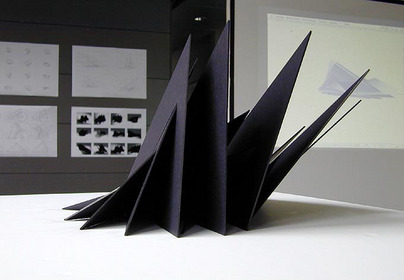
As faculty who’s job it is to advance the area of study, I’m interest in a broader stance. Besides graphs and maps [Fig.], I associate Data Visualization with time-based new media objects [Fig.], including generative designs [Fig.], interactive animations [Fig.], sonifications (turning data into sound), and art that collects data and builds upon it in form of archives and indexes. As diverse as the intent of such creative practices can be, they share an appetite for attention, devise a communication strategy, and seek the formation of knowledge. Popular strategies inherently end up becoming redundant and dated, leading to fatigue (and sometimes attention disorder)—which means we are continuously asked to reevaluate and find new ways to communicate. For this reason I find it crucial to remain radically open to all of the creative arts, and study its motivations, inspirations, and histories. I make no secret of this fact in class and believe that reoccurring themes in history (so-called tropes) can teach us a great deal about what’s next (conversely, it seems quite easy to disrupt given a healthy amount of ignorance).
My personal work is dealing with the cultural and social implications of emerging technologies and I’m curious about the ways in which technologies shape and transform civil liberties. For that reason, I’m working with data as a cultural narrative and sometimes artistic material, looking for hidden and socially relevant patterns, agendas, and points of view.
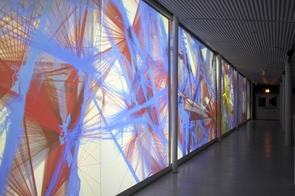
The Emergence Project , 2008 by Daniel Sauter
Why might a student consider the MS in Data Visualization at the New School ?
Aside from an exploding demand for data-literate designers, analysts, and researchers in all sectors, Data Visualization is also an area dealing with the greatest stakes in terms of impact on daily lives—in my opinion—with its shared potential for good and evil. We need a lot more data-literate artists and designers in that conversation, daring to ask better questions—based on the data created by and available to all of us.
The MS in Data Visualization at the New School provides the creative and scientific competencies for visual artists, designers, and analysts to curate and uncover insights from large and complex data sets. With a focus on social engagement, we prepare students with the critical skills to advocate visually and the intellectual context to engage a world in which data increasingly shapes opinion, policy, and decision making.
Students who would like to become data-literate advocates in a New School liberal arts context should consider this major.
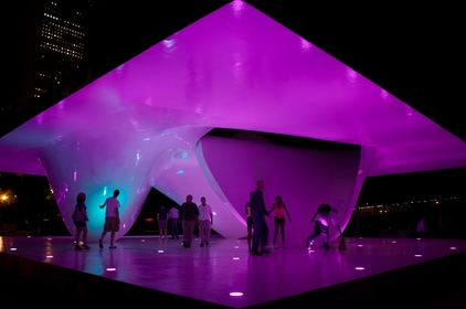
Interactive Lighting Program developed by Studio Daniel Sauter for the Burnham Centennial Pavilion
How can Data Vis inform art and design practice?
Separation of design and content is the predominant paradigm for electronic publications and periodicals, propelled by the accelerated news cycles, with teams of experts bringing it all together on-the-fly. While there is nothing wrong with this principle, its side effects often include rigid management structures built on proprietary systems and ‘creative suites’ that are hard to get over—with their own sets of implied aesthetics. Design becomes oblivious of content.
What if you could present (visualize) a compelling narrative based on a customized system you’ve built, acutely aware of its content (data)? How interesting would it be if that type of design thinking (as we know it from excellent posters and books) could co-existed in one designer’s mind? What if a student would know how to co-create with likeminded peers outside the classroom or city working on exactly on the same subject, and find pieces of code and content to build upon in an academically sound manner? What if an artist could create their an archives that fits their social practice, and sift through a host of relevant material to pursue their research?
That’s what we are trying to accomplish in this major. To speak though we need a common language, and the official language of Data Visualization is code. Code, the language of our time, plays a fundamental role in all aspects of our lives. Media theorist Friedrich Kittler (1995) argued that students today should know at least two software languages, “only then they’ll be able to say something about what ‘culture’ is at the moment.” Literary critic Katherine Hayles (2006) suggests the analogy: “as the unconscious is to the conscious, so computer code is to language… in our computationally intensive culture, code is the unconscious of language.”
As a strong believer in a liberal arts education aiming at a holistic approach to a life well lived, there is no doubt in my mind that those skills are achievable by and relevant to anyone. Our goal is to educate a Github generation of ‘uploaders’ with the critical skills to take active part in civic life for a long time to come.

Theme/logo of the 2014 “Arts Electronica in the Knowledge Capital” series in Osaka
Can you recommend any industry resources, spaces, or events for students interested in finding out more about Data Vis?
Places to start looking include the Eyeo Festival, Ars Electronica Archive, Whitney ArtPort , Visual Complexity, NYTLabs, but also local offline communities and local meetups.
Thank you Daniel!
For more info on Data Visualization, see the interview with Sauter’s colleague, Aaron Hill, Assistant Professor of Data Visualization in the School of Art, Media and Technology at Parsons The New School for Design.
…
DANIEL SAUTER
Associate Professor of Data Visualization, Art, Media and Technology
Daniel received an MFA from the University of California Los Angeles Department of Design Media Arts (’04), and a Diploma from the Karlsruhe University of Arts and Design (Germany ’02).His works have been shown internationally, including the OK Center for Contemporary Art (Ars Electronica Festival, Linz ’04 and ’09), ACM SIGGRAPH Convention and Exhibition Centers (Boston ’06 and Los Angeles ’10), China Millennium Art Museum (Beijing International New Media Arts Exhibition ’06), Metropolitan Museum of Photography (Tokyo ’05), National Taiwan Museum of Fine Arts (Taichung ’05), Witte de With Center for Contemporary Art (International Film Festival Rotterdam ’06), Microwave International Media Art Festival (Hong Kong ’06), Art Center Nabi (Seoul ’06), Luminale Biennial for Light Culture (Frankfurt ’10), Hangar Bicocca Center for Contemporary Art (Mixed Media Milan ’06), Armory Center for the Arts (Pasadena ’05), Ospedale Degli Innocenti (Beyond Media Festival Florence ’05), Telic Gallery (Los Angeles ’04), and the LA County Museum of Art LACMALab (Los Angeles ’03).