How to spot America’s most loved beer? Look for Betsy the purple cow
(cross-posted from AAS Graphic Design’s Process & Skills blog)
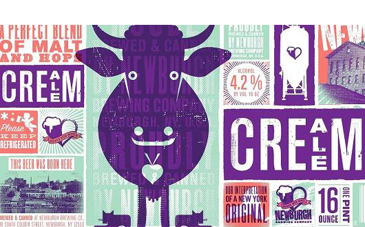
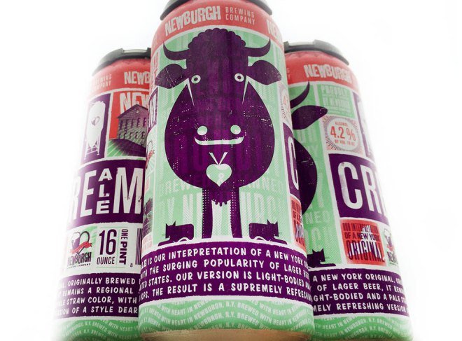
After two weeks and thousands of votes, Newburgh Brewing Co.’s Cream Ale beer label was crowned the 2015 winner ofCNBC‘s Most Loved Label competition.
Since we never tried the beer – our belief is that the man behind the design is responsible for the win. After all it was competition for the most loved label and not the best beer. The label was designed by Philadelphia-based design firm Modern Good run by Matthew Bouloutian, a former adjunct faculty at AAS Graphic Design.
It features Betsy the cow which was created for a poster for the Cream Ale a few years before.
Here is what Matthew Bouloutian told us about process of the design:
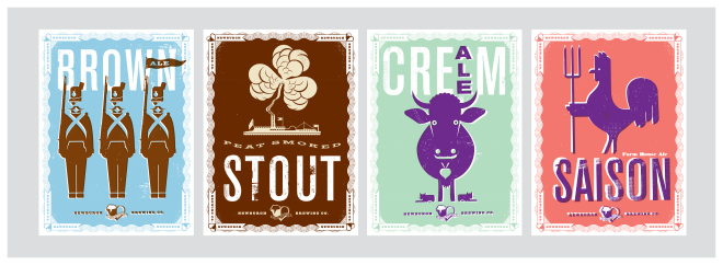
Our can design first began in 2012 when we created Betsy the Cow (with her two little side kicks) as the main subject for a promotional poster for Newburgh Brewing Company’s first beer, their cream ale. This poster along with 5 others, one for
each of their beers, was produced with the intention that when Newburgh Brewing decided to package their beer they would already have an iconic solution to represent each one. Each poster revolved around a unique illustration for the beer based on its name or character. Two years passed before the can design project became a reality. When it came time to start distributing the beer in cans,
I used our icon of Betsy, the established typography and colors from the poster to design a label, which basically looked like the poster with some adjustments. Chris Basso, the head brewmaster at Newburgh Brewing ultimately felt it wasn’t exciting enough and pushed for something more. I was surprised but Chris felt strongly about making something adventurous. He mentioned that other breweries had done some trailblazing in packaging their beer. At this point I had to do something very different. Our cow icon was already in use and wasn’t going to change so the design had to. After exploring design ideas we arrived at this patchwork, wraparound design which was engaging to pick up and explore. It allowed us to feature our beer icons as well as the town of Newburgh and other bits of information about the beer and spirit of the brewery. It also didn’t look like any other label we’d seen. There was lots to look at, read and discover. It has a pop/craft impression that is lighthearted but conveys a respect for heritage. The shelf presence is strong and I’ve heard that it’s been very successful in terms of sales… but who knows if that’s our can design or the beer! I’d like to think it’s both. Cheers.


