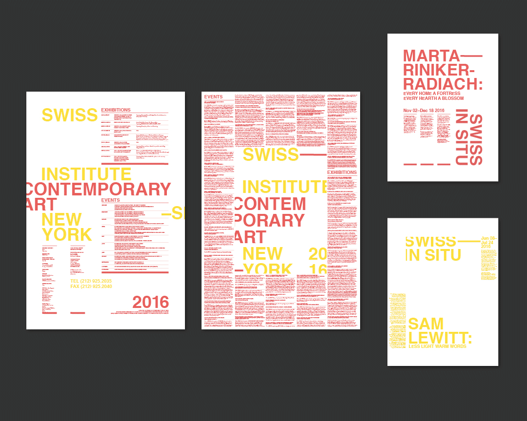
The event calendar assignment asks students to choose a venue/festival/series which has multiple events over time, and to then design a 24 x 36 inch double-sided poster for it, showcasing all of the events, artists, venues, dates, etc. Then, they are to select two events from this calendar, and design an 18 x 24 inch single-sided poster for each, attempting to consider new uses of scale and typographic form, while still communicating a connection to the larger poster. Created by: Ta Suranart Kasitipradit, Sara Hilany, Leonardo Climi, Iyana Martin, Maria Zabolotnaya, Gyuri Nam, Cheyenne Breglia, Coco Wohrle
Sean Yendrys’ sophomore Core Studio Typography class teaches students an understanding of the properties of typefaces, their context and how typography helps readers read and navigate a text. The class investigates letterform structure and type classification systems, typographic terminology, history of type and printing, principles of spacing, use of typographic contrast in composition, legibility, hierarchy, and typographic form as a tool for expression and communication. Students start by doing a short exercise which asks them to analyze the shape of letterforms, and to then re-arrange the traditionally understood alphabet in a completely new order, using a formal logic that can argue one leader following another. For the rest of the semester, the assignments frame typography through iterations of scale.
The final assignment – developed in collaboration with the Core Lab class, taught by Kellie Konapelsky – collects a set of five essays to be organized in a small reader publication. This assignment has students consider organization through repetition of elements, and how to exploit opportunities for difference within an established system.
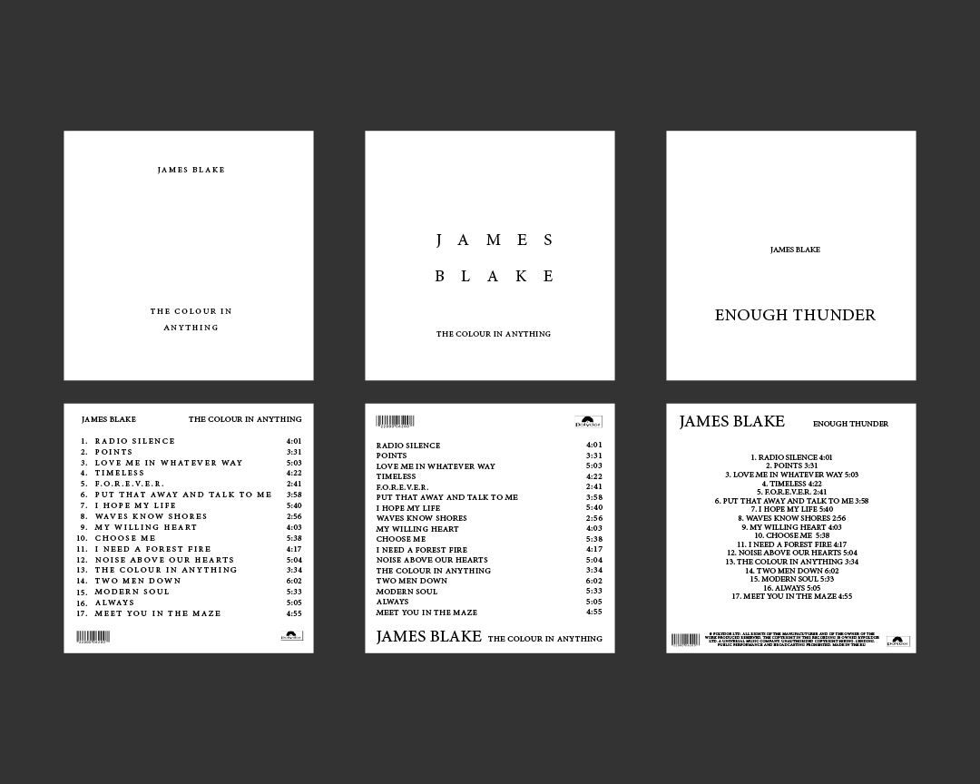
One example is a record cover assignment, which asks students to design three record covers (front & back), where the first record can only use one typeface, one weight and one type size. The two subsequent records can then only change by introducing a second (and then a third) type size only. Throughout this process, students are meant to exhaust iterations in their use of composition and hierarchy using a very restricted palette. By the end of the assignment they will have gone through over 100 variations for the three records (starting with 10 for each, then 5, then 3, etc), before focusing on a final set of 3. Created by: Bianca Jordan, “Dennis” Sang Eon Kim, Maria Zabolotnaya, Ta Suranart Kasitipradit, Lily Clempson, Ana Sofia Murillo

While waiting for their publications to be printed & bound, the class produced a short one-day in-class poster to announce our final crit. Each student was given a letter to create in any way they’d like, which were then all collected to produce a statement of many typographic flavours, which was then printed on the risograph for everyone to take home. Made in collaboration with Core Lab teacher, Kellie Konapelsky.

Iterations by Sara Hilany