Questions Concerning Health: Stress and Wellness in Johannesburg Client—Columbia Books on Architecture and the City Date—2016 Publisher—Columbia GSAPP/Columbia University Press 165 by 240 mm, 274 pages, lay flat binding with paper cover Editor—Hilary Sample. This publication for Columbia’s Graduate School of Architecture, Planning and Preservation publishing imprint Columbia Books on Architecture and the City was edited by faculty member and MOS founder Hilary Sample. This edition brings together research on the correlations between urban organization and health patterns, specifically in the city of Johannesburg. In addition to research on the history of mapping health infrastructure, the book also contains a portfolio of images by photographer Guy Tilim, proceedings from a day long symposium on health and urbanism, as well as propositions for extending the efficacy of the healthcare system through built infrastructure. Photography by Guang Xu (’14, BFA Integrated Design).
LB—O is a graphic design practice directed by Luke Bulman alongside Camille Sacha Salvador that is interested in the overlap of architecture and graphic design – the former as it functions as a frame of general and specific reference, and the latter as a mode of operating. Their work at LB—O is a reflection of these interests and forms the basis for their collaborations, often working on the development of content and message simultaneously. Increasingly, they are involved in projects that have a greater public dimension and anticipate that their work will involve graphic design not just about architecture, but in it as well, through projects that involve a closer bond between graphics and space.

Landform Building Client—Princeton University School of Architecture Date—2011 Production—Regal Printing, Hong Kong Publisher—Lars Müller Publishers 165 by 240 mm, 488 pages, casebound with jacket Editors—Stan Allen and Marc McQuade. This book, edited by Stan Allen and Marc McQuade and published by Lars Müller Publishers in Switzerland, has a broad mixture of content including design projects, design research, essays, interviews, and archival images that together reconsider the relationship between architecture and landscape. The book’s design uses heavy type and stacks of information, rendered in a gradient of grey tones, to produce a sedimentary-like effect that seemed appropriate for a book concerned with the ground. Solid color pages differentiate spaces in the book and provide pauses between stretches of more densely presented information. The book’s cover uses a richly textured charcoal-colored paper wrapped by a glossy, full-color jacket for maximum physical contrast. Photography by Guang Xu (’14, BFA Integrated Design).
The office works on public and private projects, most often in the areas of architecture, art, design, and culture with a special interest and experience in working on projects from initial conception, formation, all the way through material delivery. This degree of coordination between our collaborators and suppliers gives them the ability to align the project from beginning to end with its content, message, material, and manufacture.

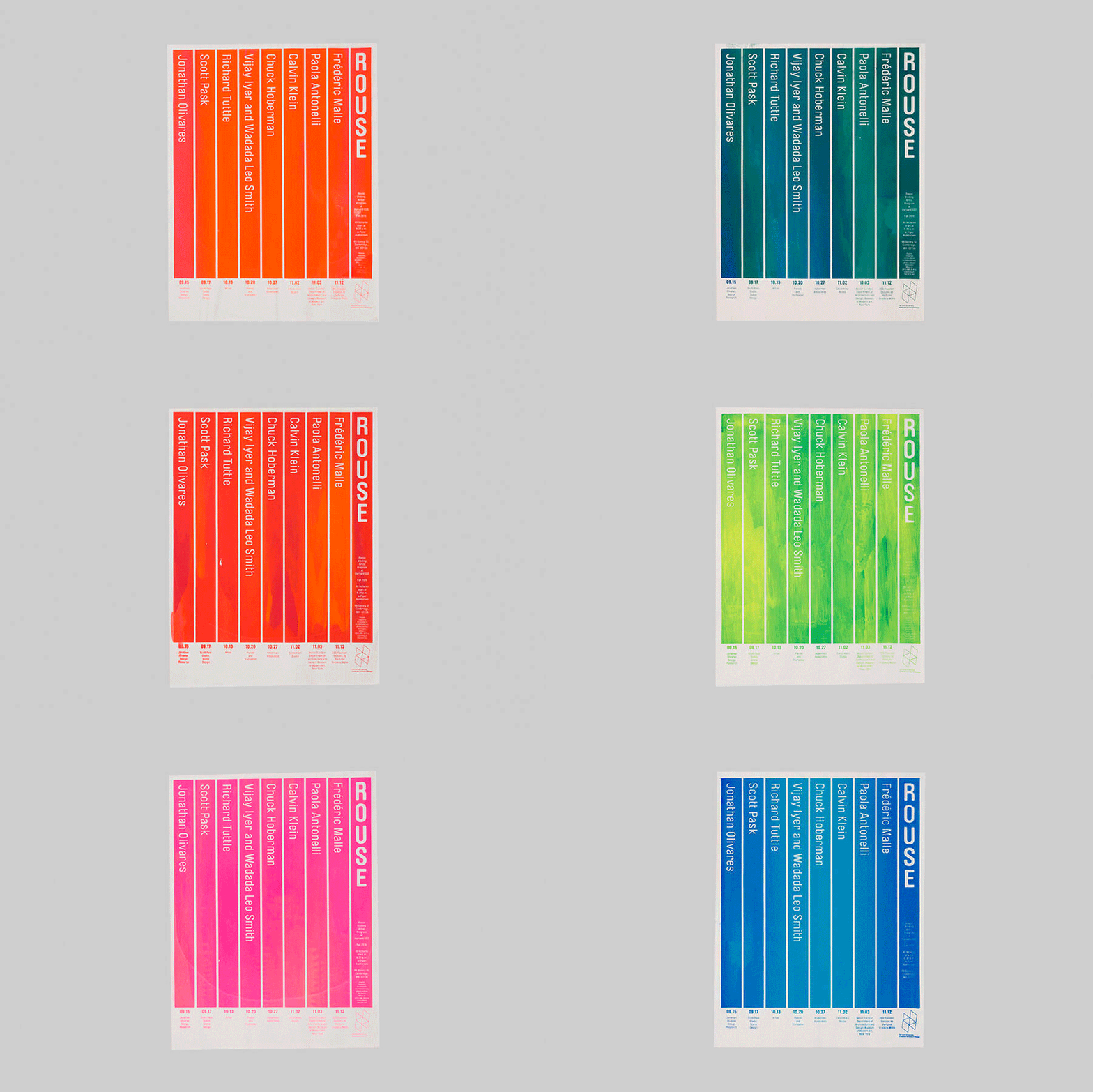
Rouse Visiting Artists program Client—Harvard Graduate School of Design Date—2015 and 2016 19 by 27 inches. While we were designing the year-long event program materials for Harvard’s Graduate School of Design we were also designing and producing the announcement poster for their Rouse Visiting Artist Program. This short run poster is ideal for silkscreening. We produce a wide range of effects from one screen by varying the ink reservoir in the screen—the aim is to produce as wide a range of effects as possible using just one print. In this way each person who receives a poster gets a unique expression. Our task is to produce variety. Photography by Guang Xu (’14, BFA Integrated Design).
Luke Bulman received an MArch degree at Rice School of Architecture, a school deeply dedicated to the book as an instrument of architectural thinking. As a graphic designer he is self-trained, but benefitted from a foundation of study with Bruce Mau in both academic and professional capacities. Camille Sacha Salvador (’14, Summa Cum Laude) is a Parsons BFA graduate in Communication Design.

Landscape as Urbanism Client—Princeton University Press Date—2016 7 by 9 inches, 216 pages, casebound Author—Charles Waldheim. As designers, we are always looking for ways in which a project’s subject and organization might indicate possible aesthetic directions. With Landscape as Urbanism we were particularly interested in the strong system-based approach to landscape that the book delves into. We thought that if we developed a simple set of rules to determine the interactions of the images and the text we could arrive at a design that both adhered to the content, and produced unexpected effects. To distinguish the text and image organization, there are two ink colors used in the book, each assigned a function: Dark blue is used for text and all navigational elements on the page. Umber is used for images and their captions, as the author had requested that the images appear “dirty”; we thought umber created that earthy effect. The book’s cover combines the dirty umber ink with florescent orange ink, a visual reference to construction site safety equipment. The combination of “natural/unnatural” echoes the book’s own engagement with the nature/culture continuum, one of the central ideas explored in Landscape as Urbanism. Photography by Guang Xu (’14, BFA Integrated Design).

Interloop—Architecture Identity Date—2009–present. Interloop—Architecture is Dawn Finley and Mark Wamble’s architecture office based in Houston, Texas. We were seeking an identity based on a typographic solution that would be distinctive in its directness. Critical to its development was the introduction of the em-dash between the two parts of their name, signaling connection. The graphic shows both a macro quality of the mark where the initials “I” and “A” of the office become expressed, while also showing the micro effect of the em-dash. The primary color of the office is a based on a physical model of color theory, see Goethe: two complimentary colors, in this case red and green, when blended create a neutral grey. Photography by Guang Xu (’14, BFA Integrated Design).
