
MALLEABLE GROTESQUE TYPEFACE — Malleable Grotesque is a 7 weight 15 font family which explores the soft nature of metals when exposed to high temperatures. Designed in 2011 with Lucas Sharp.
Juan Carlos Pagan is a New York based Designer, Typographer, and Creative Director. He received his BFA from Parsons School of Design in 2006, and completed his post graduate studies in Type Design at Cooper Union in 2011. Juan has been honored for his work by The Type Directors Club, Communication Arts, The ADC, One Show, Cannes Lions, Clios, Fastco, and Print Magazine. In 2013 Juan won the prestigious Art Directors Club Young Gun Award, honoring vanguard designers under 30. That same year he was named top of Adweek‘s Talent 100, and was the cover & featured story. Juan was also nominated for Print Magazine’s New Visual Artist 20 Under 30 that same year. He is currently a founding partner of the Creative Studio & Artist Representation agency Sunday Afternoon based in New York City, and was formerly the Head of Design and Creative Director of 72andSunny NY.

LIFTED — Poster

NIKE HOME RUN KING BAT — Collaborated with the amazing Kevin Cantrell to design the Nike perfect game, all American classic, Home Run King bat trophy. Inspired by old world typography that imbues the spirit of baseball, an illustrative, typographic treatment was created that envelopes the entire circumference of the bat. The production was accomplished using a state-of-the-art, proprietary technique by Big Secret that engineered the artwork to be laser-etched around the bat’s circumference in a seamless finish.

PRINT MAGAZINE NVA 20 UNDER 30 — Asked by Print Magazine to create custom numbers for their April 2012 New Visual Artist 20 Under 30 issue. The numbers themselves needed to act as windows allowing Print magazine to showcase the work of all 20 winners on the cover at once. Each number was then designed and constructed out of 5 individual pieces. This gave them the ability to assign a section of any given number to a winner in order to highlight their work through. This solution lent itself nicely to some Op Art moments, giving the numbers dimension when used flat. I ultimately provided them with two sets of custom numbers to use throughout the magazine. Art Direction by Ben King. Selected to be featured in Communication Arts Typography Annual 3, and Awarded a Certificate of Excellence by The Type Directors Club in 2013 TDC 59.

2016 BACARDÍ HALLOWEEN CAMPAIGN — Teamed up with Shane Griffin and BBDO NY to create the 2016 Halloween campaign for BACARDÍ. The campaign which reinterpreted the iconic BACARDÍ bat included animation and OOH wild posters to support the BACARDÍ & Kenzo Digital experience.

SURE — poster
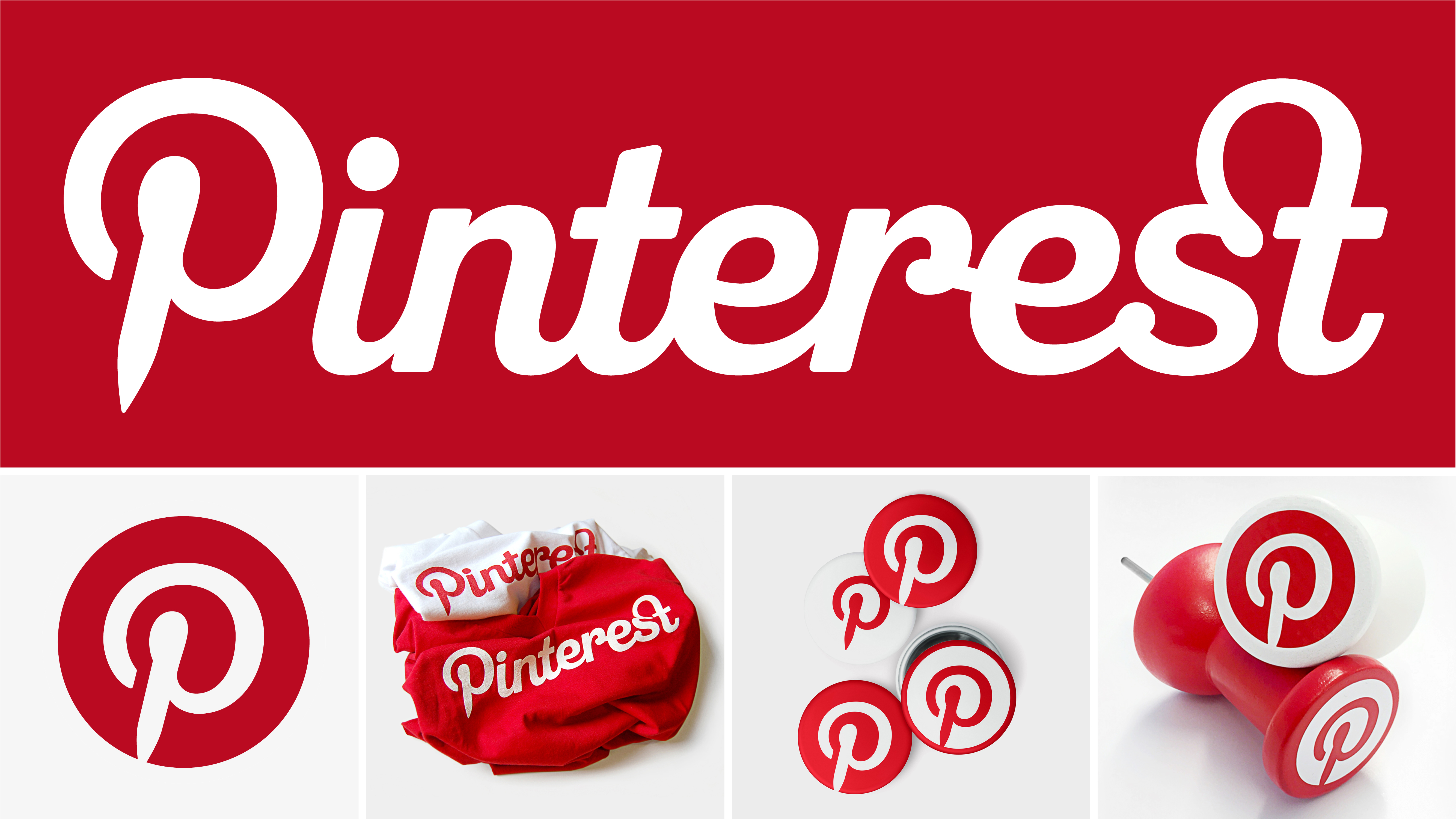
PINTEREST IDENTITY — Full custom logotype & identity for Pinterest. Designed in collaboration with Mike Deal. Winners of the 2012 How Magazine Logo Design Awards. Selected for Print Magazines 2012 Regional Design Annual. Awarded a Certificate of Excellence by The Type Directors Club, and a bronze bullet form Young Guns International.
Who do you look up to in the design community?
I tend to look outside the design community. I’ve always been a taken by the work of Ed Ruscha, Wayne White, Allen Ruppersberg, and Stephen Powers.

DESGIN CAMPAIGN — Poster campaign for Desgin. We ambitiously removed the label from the bottle, and used the bare bottle to manipulate typography which was set behind the bottle. Each word used in the campaign includes the word ‘GIN’ to elicit new associations to modernity, inspiration and social gatherings. The underlying theme of trying the gin for the first time and the experience associated with it.

ABERLOUR TYPOGRAPHY — Custom numbers for each age of whiskey in the Aberlour collection.
What has been the highlight of your career so far?
I’ve been incredibly fortunate. It would be wrong to choose just one.